Designing for Growth: NyaayDarshak Website
How I streamlined the user journey and boosted paid consultations by 32%
Background
NyaayDarshak is a Siliguri-based NGO working to combat gender inequality through one-on-one consultations and legal awareness workshops.
In accordance with my non-disclosure agreement, I have excluded and disguised any confidential information in this case study. The content of this case study is solely my own and does not necessarily represent the views of NyaayDarshak.
My role
I led the design of this project by identifying problem areas, conducting research, developing a strategy with the developers, and creating an iterative test plan for implementation.
Timeline: June-July 2024
My role: User research & UX/UI
Made with: 2 Developers
Challenge
“By the end of the onboarding process,
we lose 45% of our clients.”
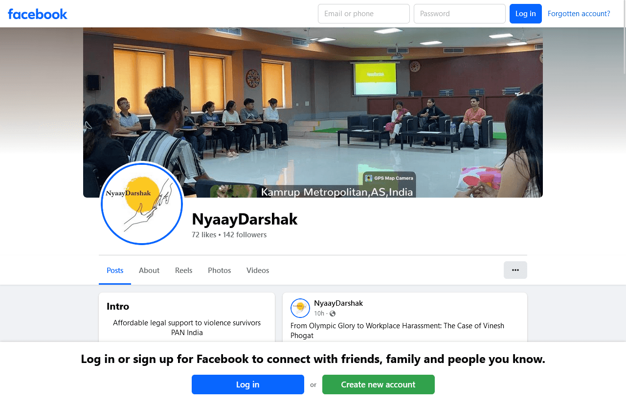
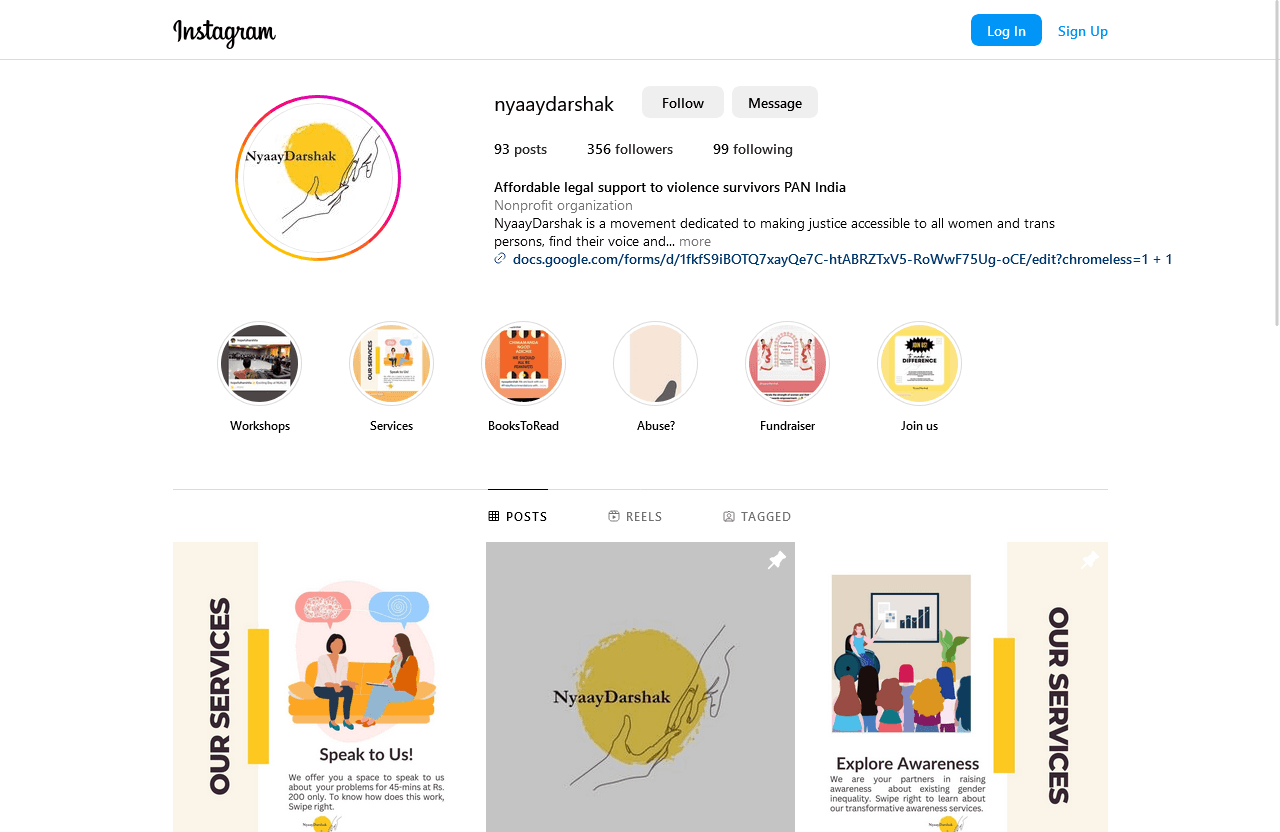
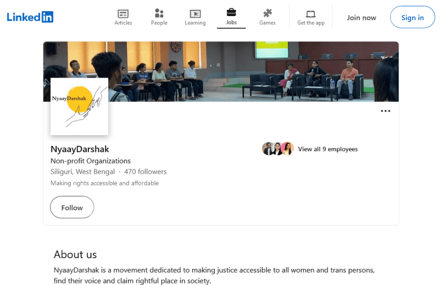
NyaayDarshak operated on social media pages such as LinkedIn, Facebook, Instagram, and Twitter/X. Maintaining a cohesive presence across these platforms was challenging and time-consuming.
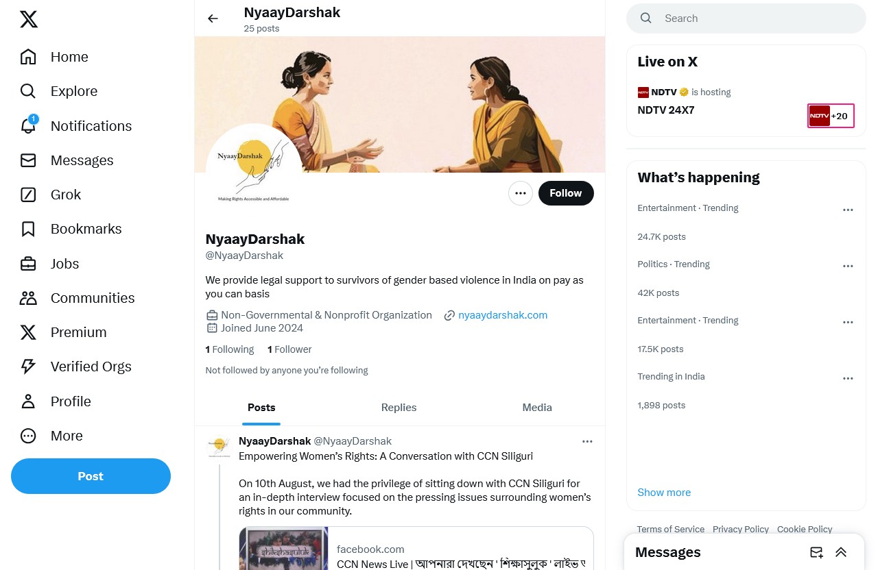
NyaayDarshak relied on a Google Doc as a user guide and Google Form for both payments and consultation scheduling.
Problem #1
No defined journey
An unclear user experience leads to user frustration, which increases drop-off rates.
Example
Users received a Google Doc with details about the types of consultations available and the steps to schedule one.
Problem #2
Inconsistent experience
Inconsistent content across multiple platforms disrupts the user experience.
Example
Each social media platform displays information differently, making it challenging to maintain a cohesive look and feel across them.
Problem #3
Cumbersome process
Sending users a link to a collection of links causes confusion.
Example
A Linktree link containing links to all social media platforms and the Google Doc does not encourage healthy interaction.
Research
I conducted multiple rounds of research, beginning with competitor teardowns and concluding with qualitative interviews and user testing studies.
10+ user
interviews
5+ competitor
teardowns
5+ usability
studies
20+ iterations
based on findings
Client problem
Problem #1
Navigation confusion
User interviews revealed that 60% of users found the Google Doc user guide confusing and difficult to understand.
Problem #2
Payment hesitation
37% of users expressed hesitation to pay the consultation booking fee due to a lack of clarity and the absence of a secure payment gateway.
How might we?
HMW #1
Benefit-first
How might we guide users to confidently schedule consultations?
HMW #2
Automatization
How might we minimize the time and effort required for onboarding users?
Defining the success metrics for this project
I decided to measure the success of the consultation scheduling feature by measuring the number of new users who scheduled consultations.
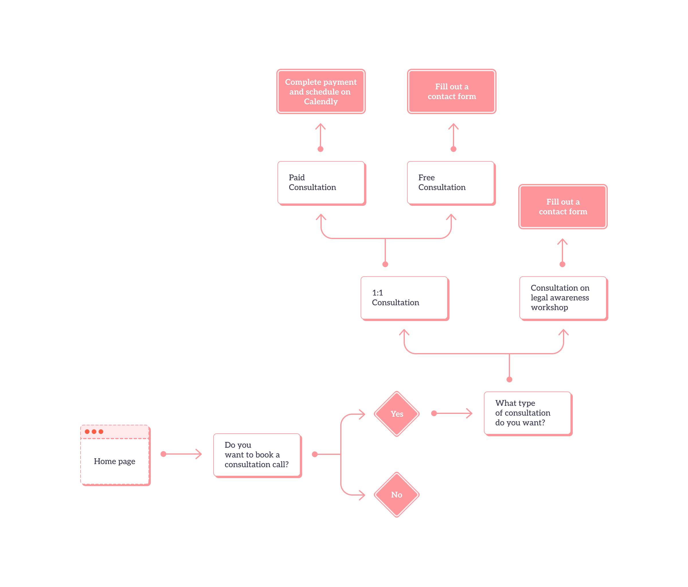
Client visits
the website
Selects a type
of consultation
Pays
consultation fee
Books a
consultation slot
Business goal #1
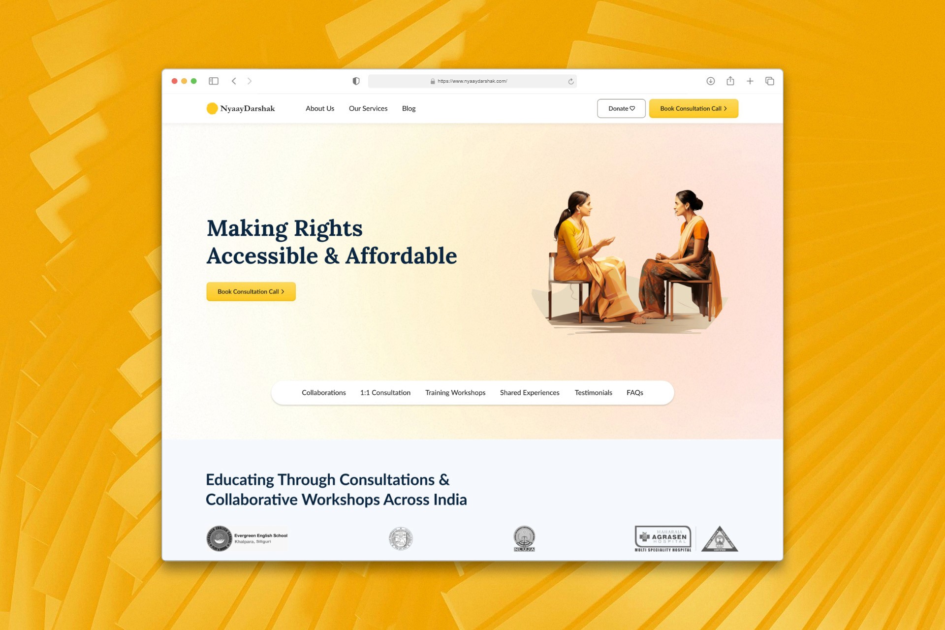
Enhance value proposition
With the new platform, we aim to emphasize NyaayDarshak’s core consulting services. Our goal is to enable clients to schedule consultations easily.
Business goal #2
Improve operational efficiency
To streamline operations, we will integrate a secure payment gateway and a calendar booking feature.
User goal #1
Provide a delightful and consistent experience
We aim to simplify content to ensure it is easily understandable and visually engaging.
User goal #2
Facilitate easy consultation scheduling
To enhance the scheduling process, we will collect only essential details and ensure a swift payment and calendar booking experience.
Evolving through feedback:
Crafting solutions that resonate with users
Based on previous research, I found that users often didn't read the document thoroughly and often failed to upload payment screenshots
Users expressed a preference for a standard booking experience, similar to booking a ticket. My hypothesis was that a streamlined consultation booking flow, requiring only essential information, would simplify and expedite the scheduling process.
Process #1
Analyzing the user journey
By leveraging user insights from interviews, I identified the gaps and opportunities in the user flow.
Process #2
Designing for trust
To address payment hesitation, I redesigned the payment page to clearly communicate the value and security.
When planning a website layout, I love using "TypeFraming." It gives me a clear view of the hierarchy and helps me spot the high-focus areas easily.
I aimed to create a cohesive experience across pages, keeping the visual theme consistent to inspire confidence and maintain the website's integrity.
The core consultation booking flow is simple: choose your consultation type, complete payment, and book your desired time slot.
Usability Improvements
After conducting multiple usability tests, I redesigned these parts to enhance the user experience by simplifying navigation and improving content accessibility.
As users scroll down, the primary CTA disappears, leaving them without a clear action. To fix this, I anchored the CTA at the bottom of the page so it stays visible while they browse.
Dividing a webpage into sections makes information easy to digest, but adding a sticky navigation for quick access to those sections enhances the user experience even more.
When I started working on this project, I had ten different ideas, but I had to narrow them down. Iterating on the layout, as shown here, helps balance user needs with business goals.
Impact
After the launch of the website, we closely monitored the analytics and found a 32% increase in paid consultations.
People found the site intuitive and easy to use, and this significantly reduced communication gaps.
"The revamp has not only increased consultation bookings
but also allowed our team to focus more on delivering
high-quality consultations.”
- Harshita Singhal, Founder, NyaayDarshak
Learnings
Early feedback and continuous iteration were key to rapidly developing the website and refining our approach.
I saw firsthand how our design improvements made it easier for people to access vital legal services. This reinforced my belief in the power of user-centered design.
Thank you!